
Some of us like to venture off into the unknown – to dabble in unfamiliar arts, like print-ready artwork. Perhaps you’re conversant with the process of creating visually appealing and technically sound artwork. In that case, you can brush up on your knowledge by skimming through this post.
Or you prefer using Printron Packaging artwork – an alternative if you need a quick solution and don’t want to make sense of the dizzying array of specifications and requirements necessary to ensure your design is print ready. Either way, this guide can help you master the art of fashioning print-ready artwork. Let’s discuss the core elements of beautiful professional prints.
1. Resolution Matters
A low-resolution artwork will look worse when printed – don’t let the digital image fool you. Always use the highest resolution artwork files possible. Scaling up an image can make it look pixelated and blurry so try to scale your artwork down instead.
Hence, a 300 DPI image should suffice for professional printing. DPI (Dots per Inch) is the unit of measurement denoting a digital image’s resolution.
Thus, a higher pixel density translates to crispier and sharper prints. But if you intend to create larger format photographs, 150 DPI would be okay as such artwork is viewable from a distance.
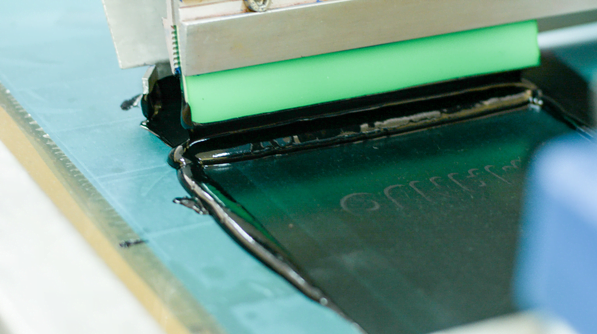
2. Remember the Bleed and Safe Zone
A bleed occurs when the artwork extends beyond the trim line of the final product. It bridges the gap between where your artwork ends and the printer’s sheet size commences, ensuring consistent printing quality. It also allows the printer to cut your artwork accurately and trim it flush along the edges.
Conversely, a safe zone is a margin around your design housing important elements such as text, logos, or other details which should be part of the image. Consider setting it at least 0.125 inches away from the trim line. That way, all your vital elements remain intact when you print.
Including a bleed and safe area in your artwork can help you achieve good-quality prints. It’s especially important when printing edge-to-edge designs such as business cards or booklets that don’t have margins.
3. Check the Color Model
Ensure your artwork is saved in the right model – CMYK (cyan, magenta, yellow and black) or RGB (Red, green and blue) formats are ideal. The former is the industry standard for printed products, and the latter applies to web graphics. Failure to use the right mode may cause the colors to shift when you go to print.
CMYK adds black to the light colors, which makes them look darker. As such, it’s advisable to adjust your artwork in CMYK mode when preparing it for print to accurately represent the colors you intend to see in your prints.
Correct coloration ensures the vibrancy of the artwork is not lost in translation from the computer to the printer. And if you’re only planning to print in black and white, switch the color mode to grayscale to convert the image to shades of gray.
If your artwork isn’t in CMYK mode, consider converting it. Your printing partner can guide you in this task. Alternatively, explore online resources to learn how to make your Pantone-based artwork CMYK compliant.
4. Proof Your Artwork
Before you hit print or send your files to a commercial printing partner, recheck every detail to ensure your artwork is ready to go. Take a step back, zoom out and look at the design so you can fix imperfections.
While at it, calibrate your monitor, so the colors appear accurately on screen. A quick spot check can avert a major printing disaster if the final images don’t match the digital design.
Besides rechecking the artwork, ask a trusted friend or teammate to check double. They may pick up on things you missed or suggest ways to improve the artwork.
5. Be Mindful of the File Type
Check the type of artwork file you’re working with. Popular software like Adobe Illustrator and InDesign are often used to create artwork for professional use. Avoid manipulation software (Photoshop comes to mind) as it leads to pixelated results, which may not be suitable for commercial printing.
You must also save your artwork in the correct format, such as pdf (Portable Document Format) or eps (Encapsulated Postscript). Similarly, your file type should be compatible with the printer you plan to use. If you’re outsourcing the job, ask your printing partner about the best file type for their machine.
The key to getting high-quality prints lies in understanding the basics and implementing them. Based on the guidelines above, you can confidently create awe-inspiring prints on your next project.

